Note
Go to the end to download the full example code. or to run this example in your browser via JupyterLite
MetricFrame visualizations#
from functools import partial

import pandas as pd
from sklearn.metrics import accuracy_score, precision_score
from sklearn.model_selection import train_test_split
from sklearn.tree import DecisionTreeClassifier

from fairlearn.datasets import fetch_diabetes_hospital
from fairlearn.metrics import (
MetricFrame,
count,
false_negative_rate,
false_positive_rate,
selection_rate,
)
data = fetch_diabetes_hospital(as_frame=True)
X = data.data.copy()
X.drop(columns=["readmitted", "readmit_binary"], inplace=True)
y_true = data.target
X_ohe = pd.get_dummies(X)
race = X["race"]
X_train, X_test, y_train, y_test, A_train, A_test = train_test_split(
X_ohe, y_true, race, random_state=123
)
classifier = DecisionTreeClassifier(min_samples_leaf=10, max_depth=4)
classifier.fit(X_train, y_train)
y_pred = classifier.predict(X_test)
zero_div_precision_score = partial(precision_score, zero_division=0)
# Analyze metrics using MetricFrame
metrics = {
"accuracy": accuracy_score,
"precision": zero_div_precision_score,
"false positive rate": false_positive_rate,
"false negative rate": false_negative_rate,
"selection rate": selection_rate,
"count": count,
}
metric_frame = MetricFrame(
metrics=metrics, y_true=y_test, y_pred=y_pred, sensitive_features=A_test
)
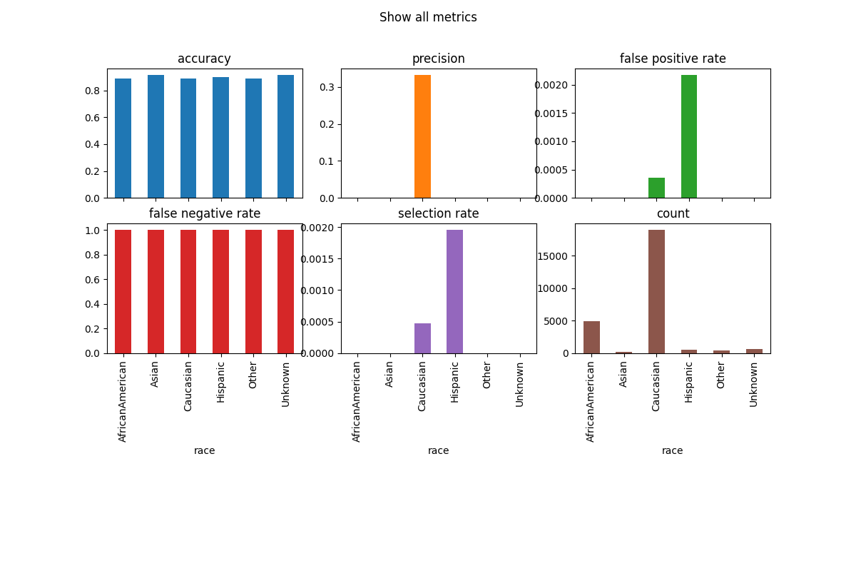
metric_frame.by_group.plot.bar(
subplots=True,
layout=[3, 3],
legend=False,
figsize=[12, 8],
title="Show all metrics",
)
# Customize plots with ylim
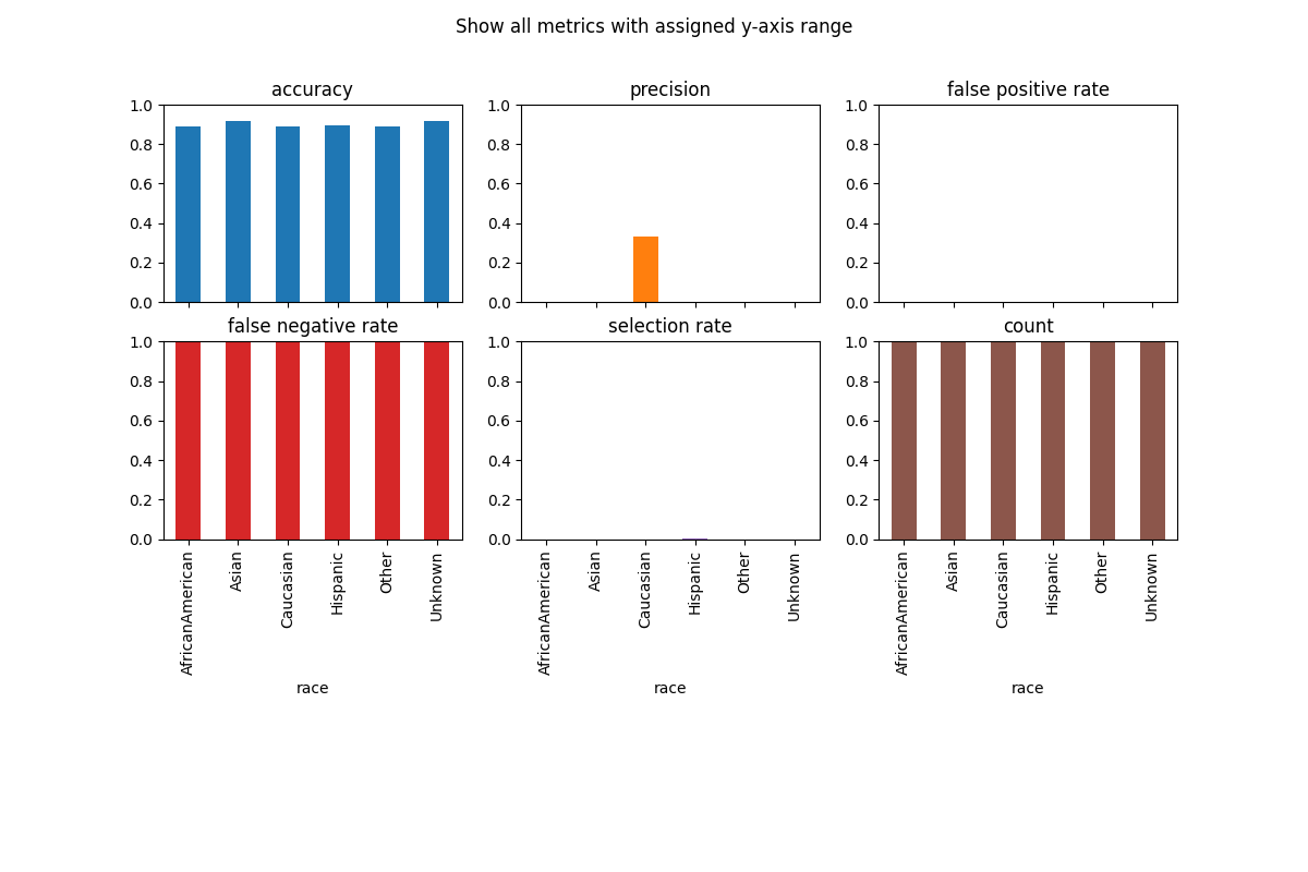
metric_frame.by_group.plot(
kind="bar",
ylim=[0, 1],
subplots=True,
layout=[3, 3],
legend=False,
figsize=[12, 8],
title="Show all metrics with assigned y-axis range",
)
# Customize plots with colormap
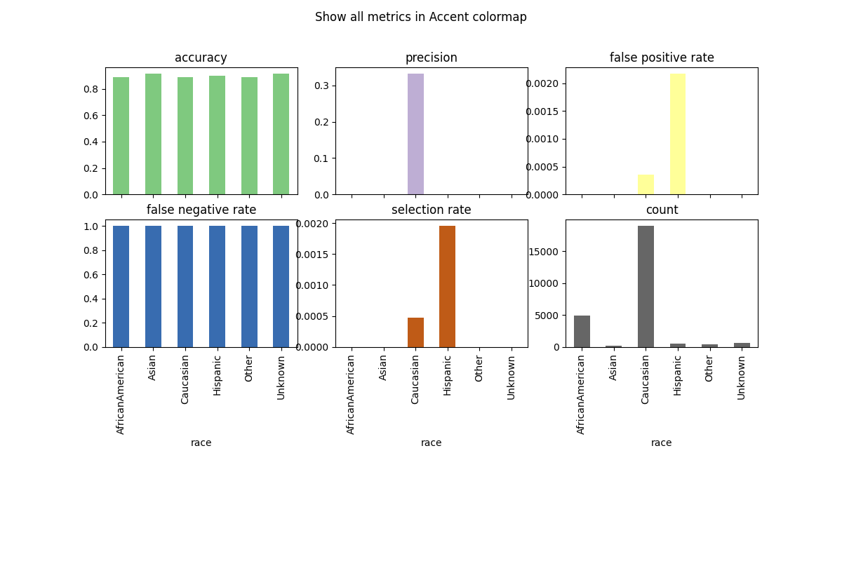
metric_frame.by_group.plot(
kind="bar",
subplots=True,
layout=[3, 3],
legend=False,
figsize=[12, 8],
colormap="Accent",
title="Show all metrics in Accent colormap",
)
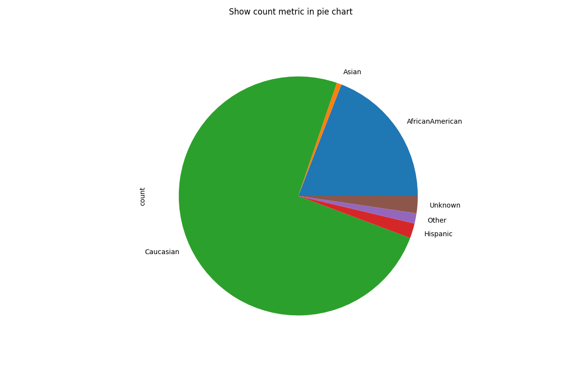
# Customize plots with kind (note that we are only plotting the "count" metric here because we are showing a pie chart)
metric_frame.by_group[["count"]].plot(
kind="pie",
subplots=True,
layout=[1, 1],
legend=False,
figsize=[12, 8],
title="Show count metric in pie chart",
)
# Saving plots
fig = metric_frame.by_group[["count"]].plot(
kind="pie",
subplots=True,
layout=[1, 1],
legend=False,
figsize=[12, 8],
title="Show count metric in pie chart",
)
# Don't save file during doc build
if "__file__" in locals():
fig[0][0].figure.savefig("filename.png")

Total running time of the script: (0 minutes 3.237 seconds)