Note
Click here to download the full example code
MetricFrame visualizations
Out:
array([[<AxesSubplot:ylabel='accuracy'>,
        <AxesSubplot:ylabel='precision'>, <AxesSubplot:ylabel='recall'>],
       [<AxesSubplot:ylabel='false positive rate'>,
        <AxesSubplot:ylabel='true positive rate'>,
        <AxesSubplot:ylabel='selection rate'>],
       [<AxesSubplot:ylabel='count'>, <AxesSubplot:>, <AxesSubplot:>]],
      dtype=object)
from fairlearn.metrics import (
MetricFrame,
false_positive_rate,
true_positive_rate,
selection_rate,
count
)
import pandas as pd
from sklearn.datasets import fetch_openml
from sklearn.metrics import accuracy_score, precision_score, recall_score
from sklearn.tree import DecisionTreeClassifier
data = fetch_openml(data_id=1590, as_frame=True)
X = pd.get_dummies(data.data)
y_true = (data.target == ">50K") * 1
sex = data.data["sex"]
classifier = DecisionTreeClassifier(min_samples_leaf=10, max_depth=4)
classifier.fit(X, y_true)
y_pred = classifier.predict(X)
# Analyze metrics using MetricFrame
metrics = {
'accuracy': accuracy_score,
'precision': precision_score,
'recall': recall_score,
'false positive rate': false_positive_rate,
'true positive rate': true_positive_rate,
'selection rate': selection_rate,
'count': count}
metric_frame = MetricFrame(metrics=metrics,
y_true=y_true,
y_pred=y_pred,
sensitive_features=sex)
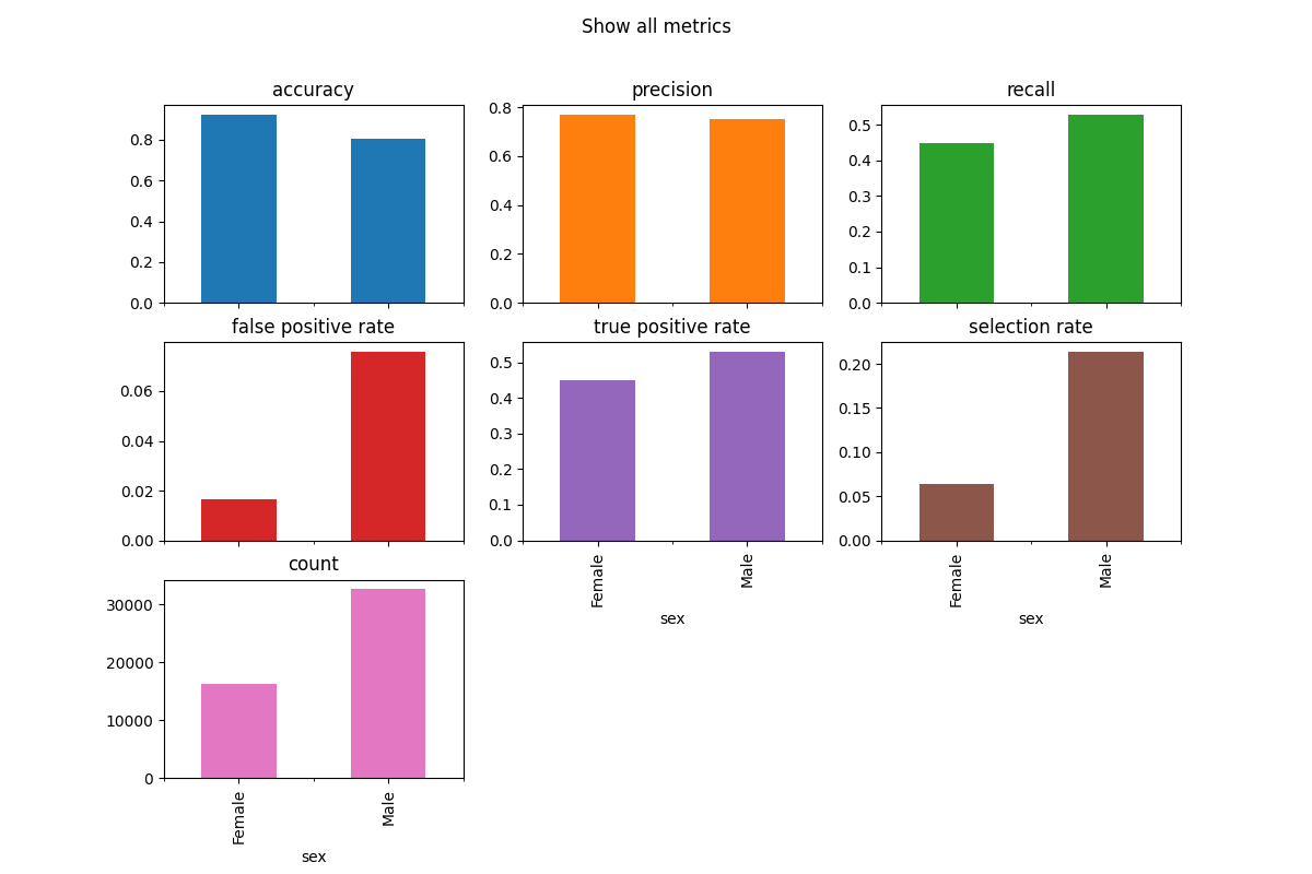
metric_frame.by_group.plot.bar(
subplots=True,
layout=[3, 3],
legend=False,
figsize=[12, 8],
title="Show all metrics",
)
# Customize plots with ylim
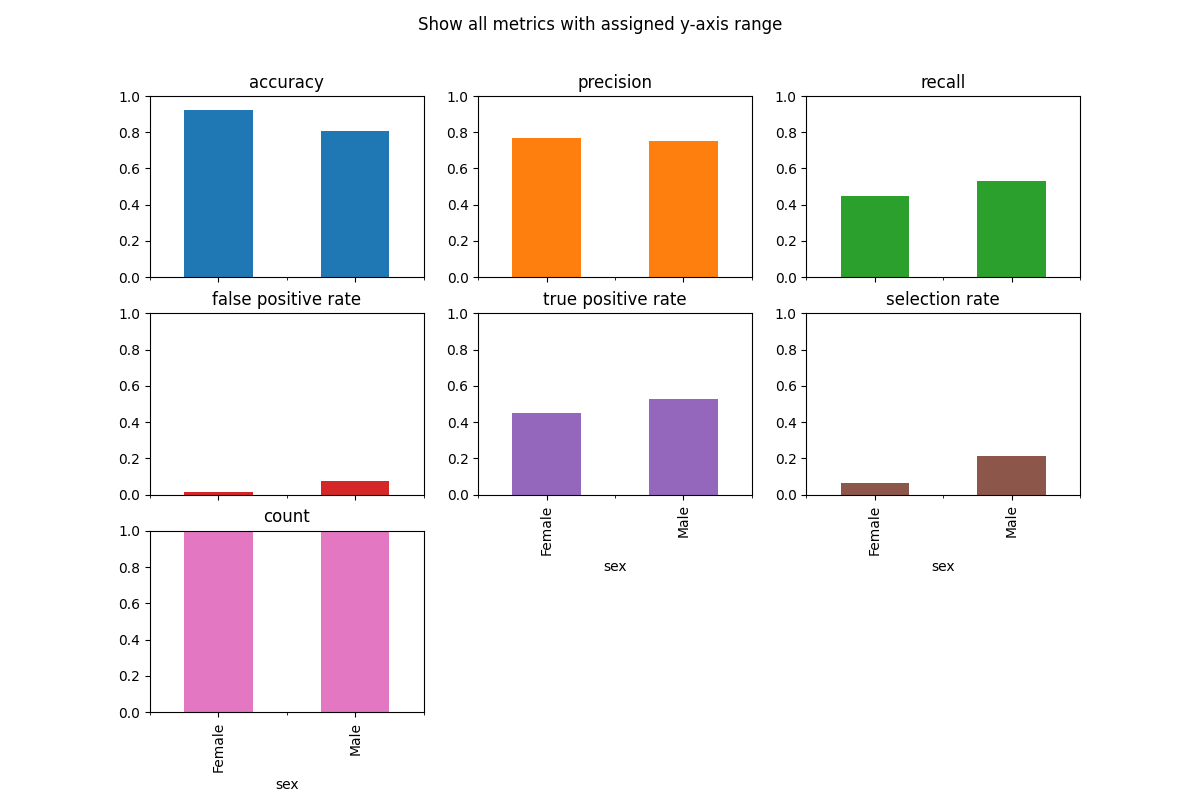
metric_frame.by_group.plot(
kind="bar",
ylim=[0, 1],
subplots=True,
layout=[3, 3],
legend=False,
figsize=[12, 8],
title="Show all metrics with assigned y-axis range",
)
# Customize plots with colormap
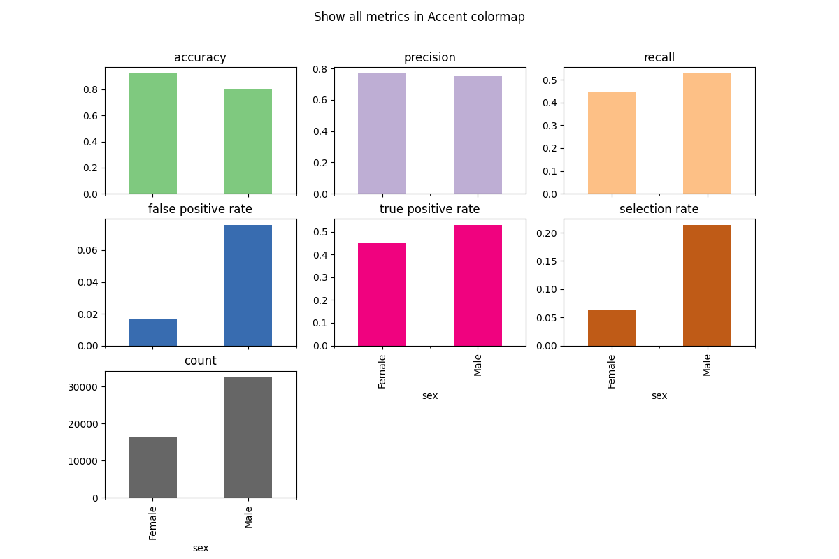
metric_frame.by_group.plot(
kind="bar",
subplots=True,
layout=[3, 3],
legend=False,
figsize=[12, 8],
colormap="Accent",
title="Show all metrics in Accent colormap",
)
# Customize plots with kind
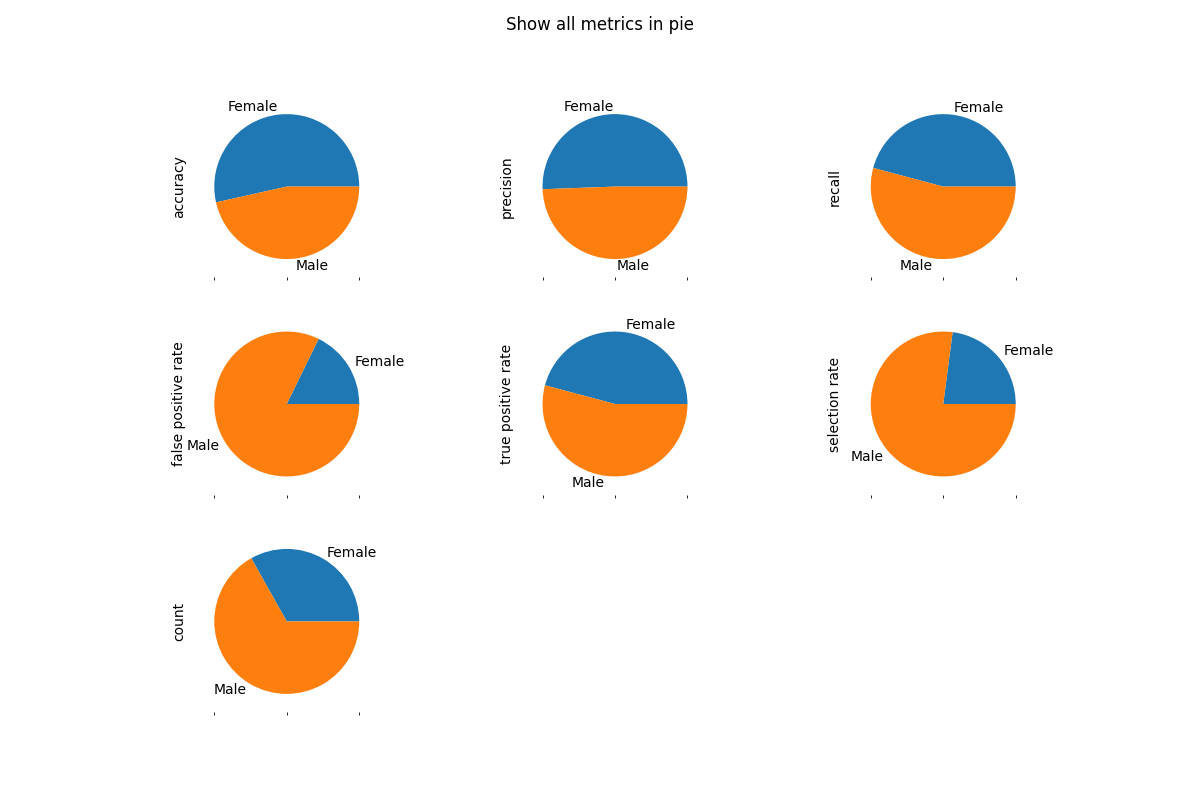
metric_frame.by_group.plot(
kind="pie",
subplots=True,
layout=[3, 3],
legend=False,
figsize=[12, 8],
title="Show all metrics in pie",
)
Total running time of the script: ( 0 minutes 4.742 seconds)