Plotting#
Plotting grouped metrics#
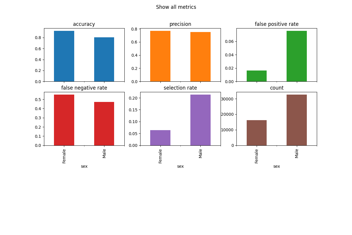
The simplest way to visualize grouped metrics from the MetricFrame is
to take advantage of the inherent plotting capabilities of
pandas.DataFrame:
metrics = {
    "accuracy": accuracy_score,
    "precision": precision_score,
    "false positive rate": false_positive_rate,
    "false negative rate": false_negative_rate,
    "selection rate": selection_rate,
    "count": count,
}
metric_frame = MetricFrame(
    metrics=metrics, y_true=y_true, y_pred=y_pred, sensitive_features=sex
)
metric_frame.by_group.plot.bar(
    subplots=True,
    layout=[3, 3],
    legend=False,
    figsize=[12, 8],
    title="Show all metrics",
)
It is possible to customize the plots. Here are some common examples.
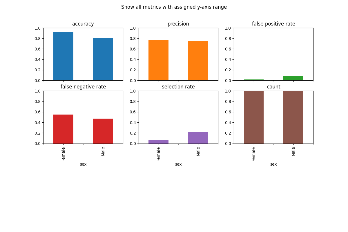
Customize Plots: ylim#
The y-axis range is automatically set, which can be misleading, therefore it is sometimes useful to set the ylim argument to define the yaxis range.
metric_frame.by_group.plot(
    kind="bar",
    ylim=[0, 1],
    subplots=True,
    layout=[3, 3],
    legend=False,
    figsize=[12, 8],
    title="Show all metrics with assigned y-axis range",
)
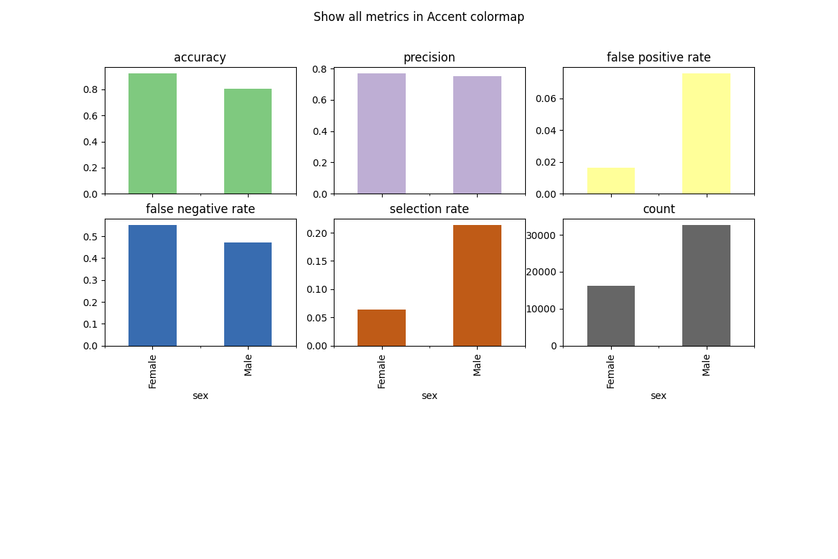
Customize Plots: colormap#
To change the color scheme, we can use the colormap argument. A list of colorschemes can be found here.
metric_frame.by_group.plot(
    kind="bar",
    subplots=True,
    layout=[3, 3],
    legend=False,
    figsize=[12, 8],
    colormap="Accent",
    title="Show all metrics in Accent colormap",
)
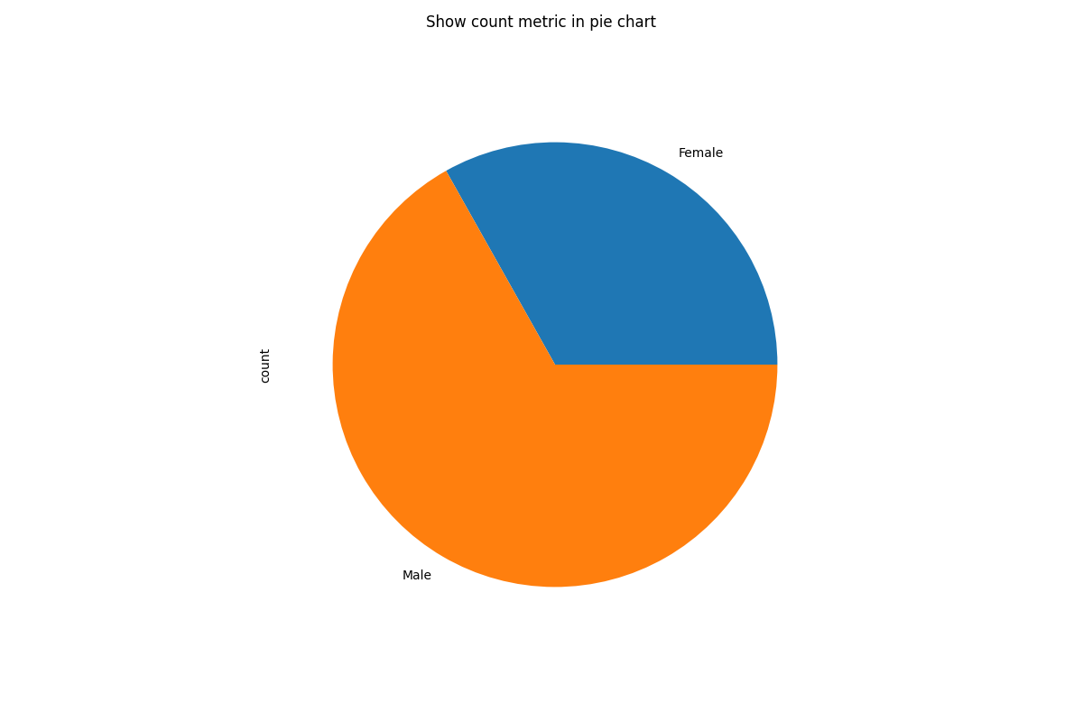
Customize Plots: kind#
There are different types of charts (e.g. pie, bar, line) which can be defined by the kind argument. Here is an example of a pie chart.
metric_frame.by_group[["count"]].plot(
    kind="pie",
    subplots=True,
    layout=[1, 1],
    legend=False,
    figsize=[12, 8],
    title="Show count metric in pie chart",
)
There are many other customizations that can be done. More information can be found in
pandas.DataFrame.plot().
In order to save a plot, access the matplotlib.figure.Figure as below and save it with your
desired filename.
fig = metric_frame.by_group[["count"]].plot(
    kind="pie",
    subplots=True,
    layout=[1, 1],
    legend=False,
    figsize=[12, 8],
    title="Show count metric in pie chart",
)

# Don't save file during doc build
if "__file__" in locals():
    fig[0][0].figure.savefig("filename.png")