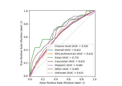
fairlearn.metrics.plot_roc_curve_by_group#
- fairlearn.metrics.plot_roc_curve_by_group(y_true, y_score, *, sensitive_features, ax=None, plot_overall=True, plot_chance_level=True, pos_label=None, title=None)[source]#
Plot ROC curves for a binary classifier disaggregated by sensitive feature.
A separate Receiver Operating Characteristic (ROC) curve is drawn for each subgroup defined by
sensitive_features, together with the area under the curve (AUC) for that subgroup. Comparing the curves makes it easy to see whether the classifier separates the positive and negative classes equally well across groups: curves that lie on top of one another indicate similar ranking performance, whereas curves that diverge indicate that the model discriminates between the classes better for some groups than for others.When more than one sensitive feature is provided, the unique combinations of their values define the subgroups (for example
"Female,White"), following the same convention asMetricFrame.Added in version 0.15.0.
- Parameters:
- y_truearray_like
The ground-truth binary labels.
- y_scorearray_like
Target scores for the positive class, such as probability estimates returned by
predict_proba(X)[:, 1]or the output ofdecision_function.- sensitive_featuresarray_like,
dictof 1d arrays,pandas.DataFrame The sensitive feature(s) used to define the subgroups. At least one sensitive feature must be provided.
- axmatplotlib.axes.Axes, optional
The axes on which to draw. If not supplied, a new figure and axes are created.
- plot_overallbool, default=True
Whether to also plot the ROC curve computed over the entire dataset for comparison.
- plot_chance_levelbool, default=True
Whether to plot the chance-level (no-skill) diagonal that a random classifier would produce.
- pos_label
int,float, bool orstr, optional The label of the positive class. When
None, the positive class is inferred by scikit-learn (1 when the labels are in{-1, 1}or{0, 1}).- title
str, optional The title to set on the axes, for example the name of the estimator.
- Returns:
- matplotlib.axes.Axes
The axes on which the curves were drawn.
Notes
This function only produces the plot. To obtain the AUC scores programmatically, use
MetricFramedirectly, which is the idiomatic way to disaggregate any metric in Fairlearn:from sklearn.metrics import roc_auc_score from fairlearn.metrics import MetricFrame mf = MetricFrame( metrics=roc_auc_score, y_true=y_true, y_pred=y_score, sensitive_features=sensitive_features, ) mf.by_group # AUC per subgroup mf.overall # AUC over the whole dataset
Each subgroup must contain both classes for its ROC curve and AUC to be well defined. To further customize the appearance of the plot, pass an existing
matplotlib.axes.Axesviaaxor restyle the returned Axes.