

Plotting#
Plotting grouped metrics#
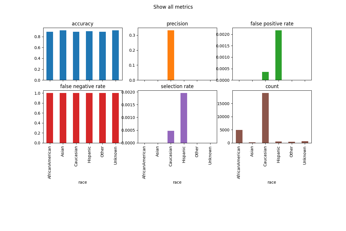
The simplest way to visualize grouped metrics from the MetricFrame is
to take advantage of the inherent plotting capabilities of
pandas.DataFrame:
metrics = {
    "accuracy": accuracy_score,
    "precision": zero_div_precision_score,
    "false positive rate": false_positive_rate,
    "false negative rate": false_negative_rate,
    "selection rate": selection_rate,
    "count": count,
}
metric_frame = MetricFrame(
    metrics=metrics, y_true=y_test, y_pred=y_pred, sensitive_features=A_test
)
metric_frame.by_group.plot.bar(
    subplots=True,
    layout=[3, 3],
    legend=False,
    figsize=[12, 8],
    title="Show all metrics",
)
It is possible to customize the plots. Here are some common examples.
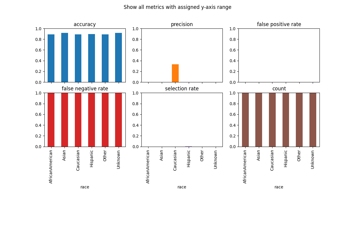
Customize Plots: ylim#
The y-axis range is automatically set, which can be misleading, therefore it is sometimes useful to set the ylim argument to define the yaxis range.
metric_frame.by_group.plot(
    kind="bar",
    ylim=[0, 1],
    subplots=True,
    layout=[3, 3],
    legend=False,
    figsize=[12, 8],
    title="Show all metrics with assigned y-axis range",
)
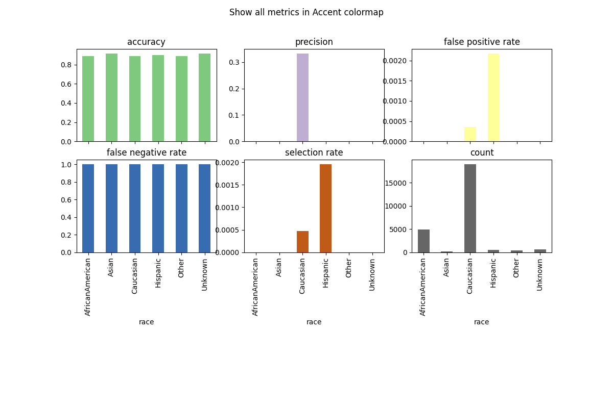
Customize Plots: colormap#
To change the color scheme, we can use the colormap argument. A list of colorschemes can be found here.
metric_frame.by_group.plot(
    kind="bar",
    subplots=True,
    layout=[3, 3],
    legend=False,
    figsize=[12, 8],
    colormap="Accent",
    title="Show all metrics in Accent colormap",
)
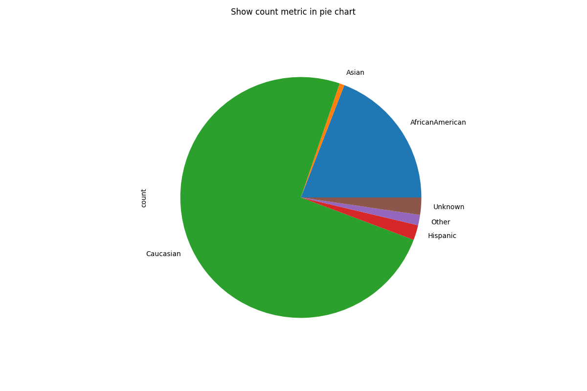
Customize Plots: kind#
There are different types of charts (e.g. pie, bar, line) which can be defined by the kind argument. Here is an example of a pie chart.
metric_frame.by_group[["count"]].plot(
    kind="pie",
    subplots=True,
    layout=[1, 1],
    legend=False,
    figsize=[12, 8],
    title="Show count metric in pie chart",
)
There are many other customizations that can be done. More information can be found in
pandas.DataFrame.plot().
In order to save a plot, access the matplotlib.figure.Figure as below and save it with your
desired filename.
fig = metric_frame.by_group[["count"]].plot(
    kind="pie",
    subplots=True,
    layout=[1, 1],
    legend=False,
    figsize=[12, 8],
    title="Show count metric in pie chart",
)

# Don't save file during doc build
if "__file__" in locals():
    fig[0][0].figure.savefig("filename.png")
Plotting ROC curves by sensitive feature#
To assess how well a binary classifier separates the positive and negative
classes for each subgroup, plot_roc_curve_by_group() draws one Receiver
Operating Characteristic (ROC) curve per group defined by the sensitive
feature(s), along with the overall curve and a chance-level baseline. Curves
that lie on top of one another indicate similar ranking performance across
groups, while diverging curves indicate that the model discriminates between
the classes better for some groups than for others.
plot_roc_curve_by_group(y_test, y_score, sensitive_features=A_test)
plt.show()
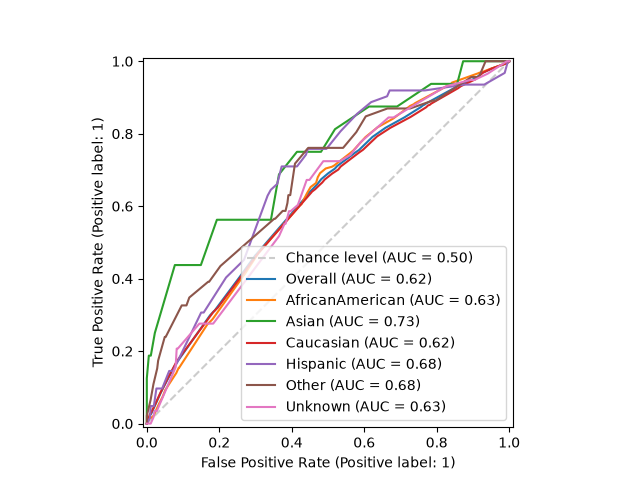
The function only produces the plot. To obtain the AUC scores themselves, use
MetricFrame with sklearn.metrics.roc_auc_score, passing the
scores as y_pred. See the full
Plotting ROC curves by sensitive feature example for details.